One clear intent from the first click
The campaign message sets an expectation the landing page continues.
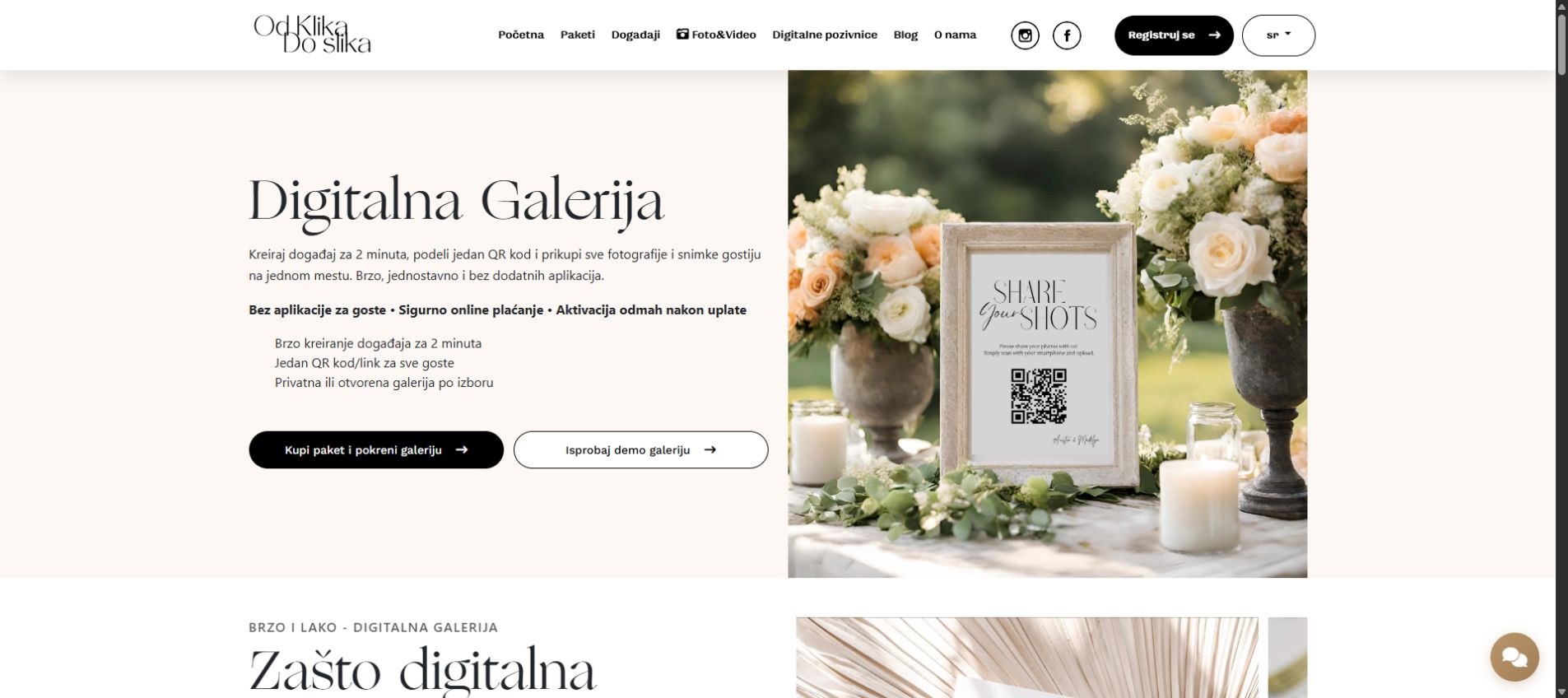
OdKlikDoSlika had a product ordering flow losing users between click and image upload. We rebuilt the UX around decision clarity, progress visibility and fewer required steps.
Conversion through flow simplification, not just prettier design.
This record separates what is publicly verifiable from outcomes that require client consent and time-based measurement.
OdKlikDoSlika was treated as one decision path: what the visitor sees in the ad continues through the landing page, gallery selection and the next action.
The campaign message sets an expectation the landing page continues.
The page structure explains the offer and next step without guesswork.
The digital gallery works as part of the flow, not as a detached portfolio.
The visitor knows what they get and where to continue the conversation.
For OdKlikDoSlika, I worked across the full path: website structure, visual system, digital gallery, SEO foundations and Google Ads-to-landing alignment.
The path from ad to image selection left too much room for confusion and drop-off.
I restructured the pages, organized the gallery and aligned copy, SEO and campaign intent.
Visitors get clearer context, understand the offer faster and have a more natural route to inquiry.
Website structure, responsive layout, visual system and the path from first visit to contact.
Work is organized so selection is quick, understandable and usable on mobile.
Landing headlines, content, internal paths and Google Ads messaging support the same user intent.
Before: The ad and landing page did not set the same expectation.
After: Campaign message, page headline and next step now follow one decision path.
Before: Visitors had to infer how to move from the click to image selection.
After: Gallery and navigation guide the visitor through selection and inquiry.
Before: SEO, design and campaigns were treated as separate tasks.
After: Website, content, technical foundations and ads work as one system.
Instead of templated SEO copy, the focus is on business impact and the path to conversion.
The emphasis is on implementation, decisions and operational logic.
We clearly show what was changed and why it matters for the result.
We describe how the change affected delivery quality and work speed.
No fake reviews. We use real process evidence and a structure ready to be filled with verified client statements later.
The user understands the page topic but has no clear next step toward contact.
Meta, hero and CTA do not communicate the same commercial signal.
Service, local and proof URLs are not connected into a decision system.
One main CTA per page and a limited number of secondary options so the user moves into concrete contact more easily.
Send your goal and URL and we will return an SEO priority order.
Send an SEO inquiryIf you need a price range and phased plan.
Request an estimateIf you need a quick decision with consultation.
Book a callIf you want to start from the basic context.
Send an inquiryA controlled work order: strategy, architecture, production and optimization driven by inquiry signals.
We map the goal, commercial intent and the shortest path to results.
We set up the section structure and links to the support, geo and proof layers.
Content and UX are refined in a clear order without piling up thin URLs.
We watch inquiries and contact signals, then strengthen the sections that drive conversion.
Each page is connected to the main service hub, supporting content, local commercial URLs and the proof layer.
Short answers to questions that block decisions and slow down the move to inquiry.
Yes. When there are no public numbers, we show the process, technical scope and operational effect without embellishment.
You see how we think, how we implement and what we consider a success signal.
Yes. The working model adapts to your process, capacity and growth stage.
Send 5-6 sentences about your goal and get a direction recommendation: what to do first, in what order and how to measure results.